University Project
Wireframes, UI Design & Front-End Development
4 Months
2022
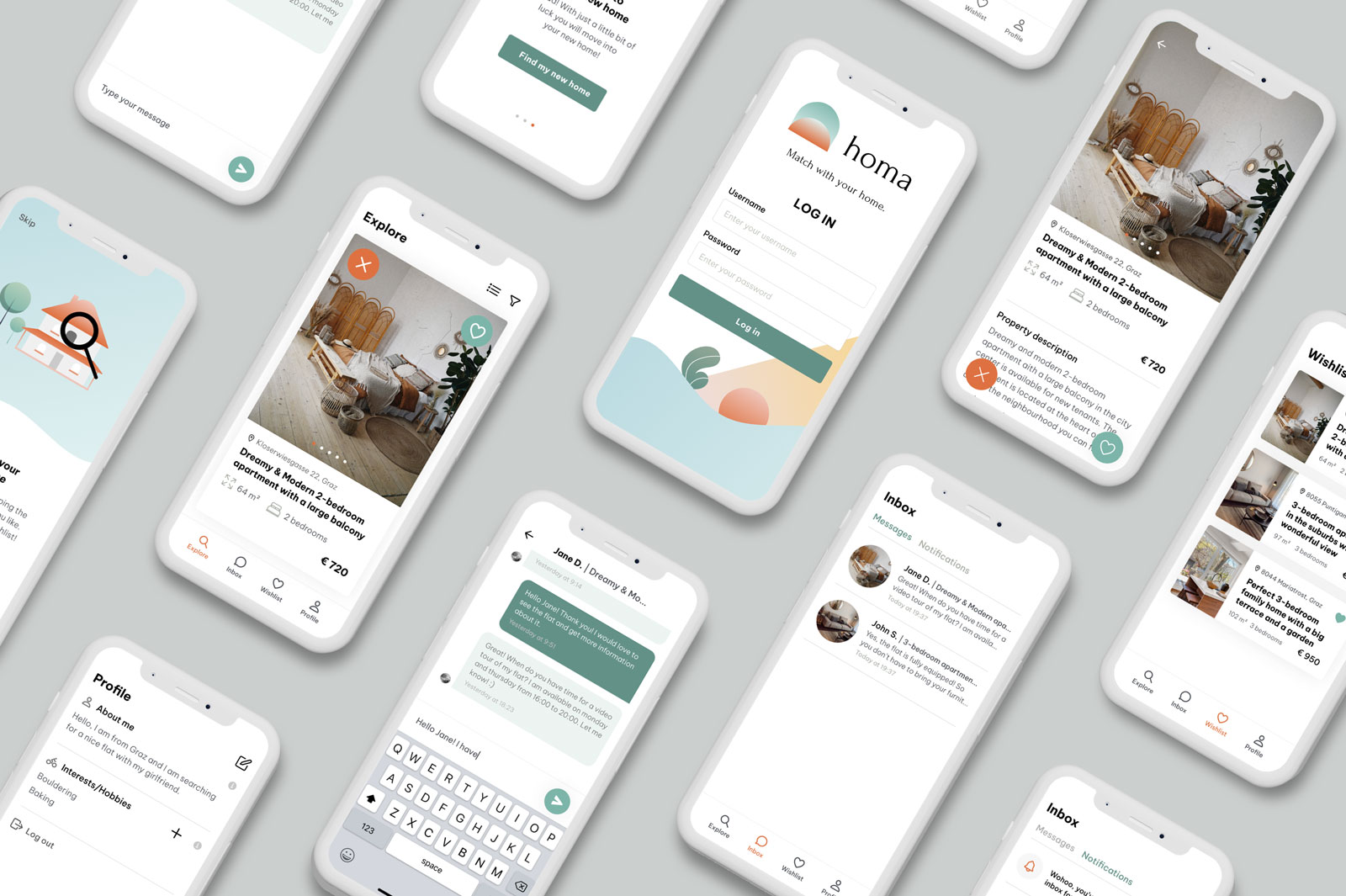
Homa is like Tinder, except that it helps users find their future accommodation. In addition, it is intended to make communication for property owners easier because only the owner can choose with which potential renters they want to initiate conversations.
The project was divided into three phases.
The word “homa” is formed by combining the first two initials of the following two words: house and match.
The logo consists of two rounded shapes and a modern, yet at the same time, classical serif typography – just like there are multiple flats out there, modern and more traditional. We wanted our logo to convey this. Basically, the round shape in the front represents you, me, or anyone else needing a flat matched to them. The back shape represents a door to the new home. The two together represent that person entering a new home.
Our base color is made of a blue-green mixture. The reason behind this is that blue is associated with harmony and reliability, and green color connotates optimism and calmness. Just as our home should make us feel.
We then created its darker shade to achieve a good contrast with the white typography. As a complement to the cold color palette, we added a warm orange.
Additionally, we added neutral colors for the text. A lot of white space was used to avoid overpowering the user with colors.
Colin Sean Kavanagh
Špela Bricman
Špela Bricman
Colin Sean Kavanagh
Colin Sean Kavanagh