University Project
Research, Research Synthesis, Mockups & Prototype
24 Hours
2022
This project is a result of a design challenge sprint. We had just a couple of hours to conduct activities such as user research, research synthesis, ideation, wireframing, and design.
The project goal was to create a high-fidelity prototype of a solution that helps users (Millennials) understand data from connected devices to motivate them to stay active. We were tasked to focus on just a few screens and not the overall completion of the solution.
During the definition phase, it was essential for us to define the problem that we are addressing. Based on the collected information from the previous phase, we created a proto-persona and job stories. Furthermore, we started generating design concepts and ideas with the help of the Crazy 8’s exercise. Finally, we gathered all the collected information through the project rundown. Read more
Building an empathy and understanding the market.
In the given timeframe (about 20 minutes), we conducted three semi-structured interviews with the following predefined questions:
The interviews took place at the FH JOANNEUM, and the interviewees were chosen randomly. Due to lack of time, we only got to interview three students, of which all were female.
We looked at the popular fitness apps such as FitBit, Nike Run Club, MyFitnessPal, and Apple Fitness. In addition, we also took a look at the VeSync app since it allows users to track their progress and set their fitness goals. We were mostly paying attention to how these apps are presenting the important information to the users.
Some of the app screenshots of the screens that we thought could be beneficial to our concept are shown above. The screenshots were collected in Miro.
Our review of the apps found that there are a lot of icons and illustrations included in them. This prevents users from becoming overwhelmed with too much text. In addition, the contrast between less and more important information is clearly defined by using either different font sizes, colors, etc.
In the given timeframe (about 20 minutes), we conducted three semi-structured interviews with the following predefined questions:
The interviews took place at the FH JOANNEUM, and the interviewees were chosen randomly. Due to lack of time, we only got to interview three students, of which all were female.
We looked at the popular fitness apps such as FitBit, Nike Run Club, MyFitnessPal, and Apple Fitness. In addition, we also took a look at the VeSync app since it allows users to track their progress and set their fitness goals. We were mostly paying attention to how these apps are presenting the important information to the users.

Some of the app screenshots of the screens that we thought could be beneficial to our concept are shown above. The screenshots were collected in Miro.
Our review of the apps found that there are a lot of icons and illustrations included in them. This prevents users from becoming overwhelmed with too much text. In addition, the contrast between less and more important information is clearly defined by using either different font sizes, colors, etc.
Due to short time frame, we could not obtain a representative sample of users. To gain a deeper understanding of our users, more interviews with different demographics should be conducted.
Similarly, market research was done too quickly and not thoroughly enough. It would require more effort to fully comprehend mental models.
Defining the problem, creating a proto persona and job stories, and ideating.
At this point, we brought up the problem again. Despite wanting to lead a healthy lifestyle, users lack motivation. Due to their difficulty comprehending the data they receive from their smart devices, they do not know how to prioritize and set clear goals. Therefore, the following question was our guidance throughout the design process:
What is the best way for us to present data to the users so that they can maintain a healthy lifestyle?
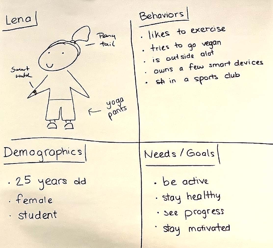
Based on the interview outcome, we generated our proto persona. The first draft was incomplete and not representative enough. This required revisiting this step and improving our persona. Below you will find the first draft.
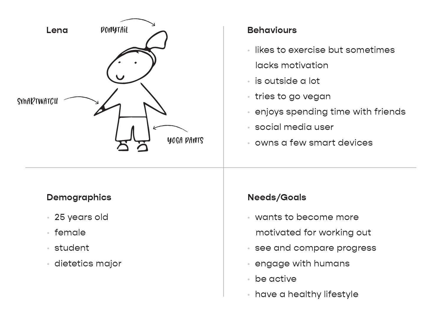
The following revisited persona provides more detailed information about its behavior, demographics, and needs.
Our next step was generating job stories. This was initially done with the help of sticky notes. First, we listed as many points as possible connected to our concept. Next, we created three categories: Events, Anxieties/Motivations/Desires, and Outcomes. We then separated the points into appropriate categories, and drew connections, as you can see in the image below.
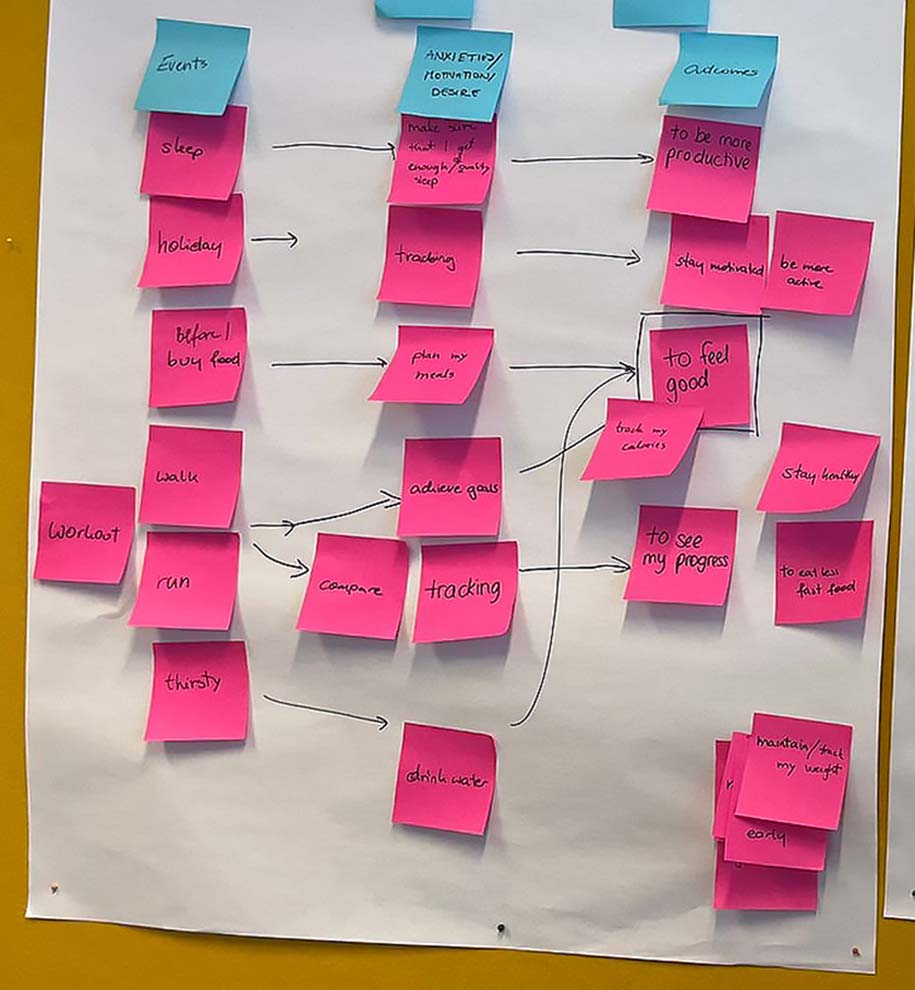
This was our guide towards creating job stories. Our job stories were as follows:
“When I workout, run or walk, I want to compare the data with previous or simply track the data, so I can see my progress.” “When I am on holiday, I want to track my activity, so I can stay motivated or be more active.” “When I am active, I want to be encouraged and reminded of my progress, so I can stay motivated.”
In this step we were generating design ideas with the help of the technique called Crazy 8’s. Each team member was presented with a piece of a blank paper, which we folded into eight sections. In 8 minutes, each member then sketched one idea into each section. Our ideas were then discussed and gathered into a feasible design concept. Outcome of the mentioned method is shown below.

Finally, we produced an app concept that enables users to help raise money for their favorite charities by participating in different activities that track distance, thus motivating them to become more active.
At this point, we brought up the problem again. Despite wanting to lead a healthy lifestyle, users lack motivation. Due to their difficulty comprehending the data they receive from their smart devices, they do not know how to prioritize and set clear goals. Therefore, the following question was our guidance throughout the design process:
What is the best way for us to present data to the users so that they can maintain a healthy lifestyle?
Based on the interview outcome, we generated our proto persona. The first draft was incomplete and not representative enough. This required revisiting this step and improving our persona. Below you will find the first draft.
The following revisited persona provides more detailed information about its behavior, demographics, and needs.
Our next step was generating job stories. This was initially done with the help of sticky notes. First, we listed as many points as possible connected to our concept. Next, we created three categories: Events, Anxieties/Motivations/Desires, and Outcomes. We then separated the points into appropriate categories, and drew connections, as you can see in the image below.
This was our guide towards creating job stories. Our job stories were as follows:
“When I workout, run or walk, I want to compare the data with previous or simply track the data, so I can see my progress.”
“When I am on holiday, I want to track my activity, so I can stay motivated or be more active.”
“When I am active, I want to be encouraged and reminded of my progress, so I can stay motivated.”
In this step we were generating design ideas with the help of the technique called Crazy 8’s. Each team member was presented with a piece of a blank paper, which we folded into eight sections. In 8 minutes, each member then sketched one idea into each section. Our ideas were then discussed and gathered into a feasible design concept. Outcome of the mentioned method is shown below.

Finally, we produced an app concept that enables users to help raise money for their favorite charities by participating in different activities that track distance, thus motivating them to become more active.
“Our user is a millennial, who is dedicated to maintaining a healthy lifestyle. We will improve her fitness and wellness experience. Which, in terms of a 5-year-old would understand, is to make her happy and feel good. Currently, this user struggles because she is lacking the motivation to stay active. It’s like driving blind. In a perfect world, she would be able to have and maintain a healthy lifestyle.”
Our logo design consists of a symbol paired with conventional typography. Heart and progress, two components of our concept, are emphasized in the symbol we designed.
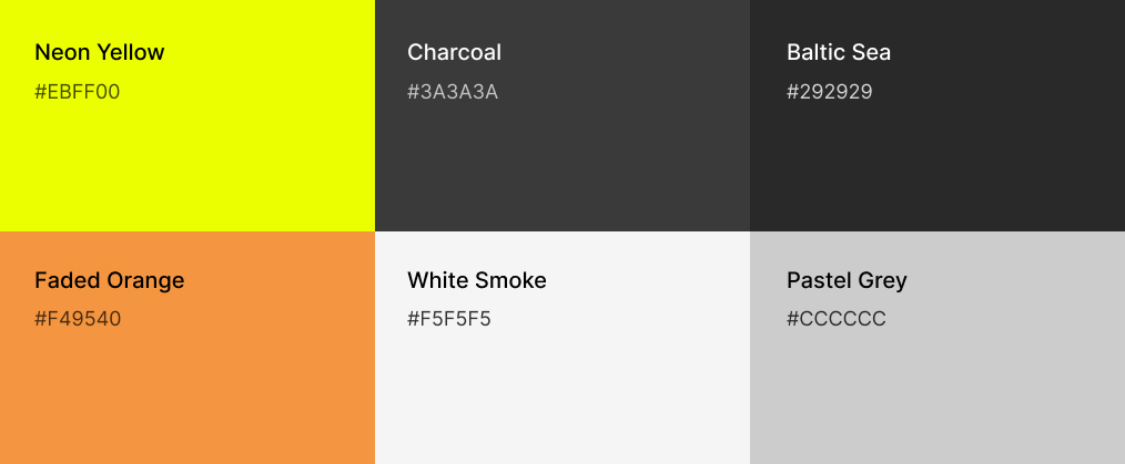
There are six colors in the palette: neon yellow, charcoal, baltic sea, faded orange, white smoke, and pastel grey. We chose yellow as our primary color because of its positive connotations: it increases energy levels, it promotes happiness and mental activity. Exactly what we want to achieve with our concept!
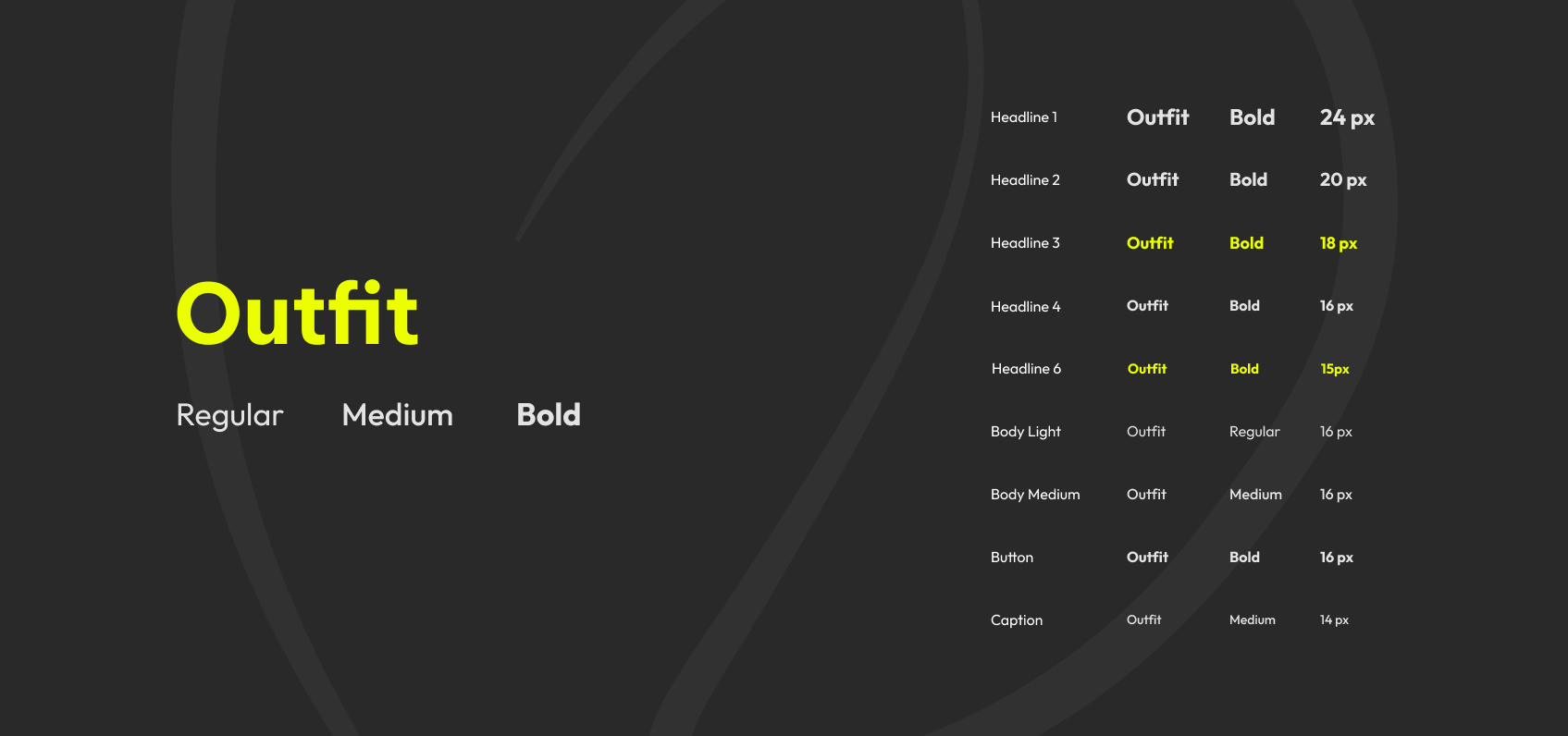
For our concept, we stayed with only one typeface: Outfit. We did, however, use three variations of this font-family: regular, medium, and bold. We chose it since it provides good readability.
(1) On Home, users have an overview of two active charity activities sections: “My activities” and “My friends’ activities.” Each activity box includes the following information:
(2) With the help of the hamburger menu and the bottom navigation bar, users can easily navigate through the app. We decided to add shortcuts to screens, such as Create New Activity, Home, and User Profile in the bottom navigation bar so users can easily and as fast as possible reach them.
(1) On User Profile screen users have an overview of their statistics, so they can track their progress. In addition, they can access information regarding their past experience. Users can also collect awards.
(2) Activity Progress screen presents users with information regarding the current activity. It includes the following details:
We added weekly progress updates to keep users informed and encourage them to be active. We decided that the organization name and date should be positioned together on the left-hand side rather than separated and on different sides.
Considering this is also a fitness app, we thought it would be a good idea to add data such as users’ calorie burn, distance, and average heart rate to the activity progress screen. The wireframes were missing information regarding the organization for which the user was raising funds, so we added it.
To give the users more freedom when inputting data, we decided to change the amount buttons into a text field. Additionally, we added the currency switcher so that users from different countries can select their preferred currency.
At the wireframes, we were missing the option that would allow users to manually enter the amount of donation, so we decided to add it. Nevertheless we also provide them with some quick options, that we thought would be reasonable and affordable for Milennials.
Our logo design consists of a symbol paired with conventional typography. Heart and progress, two components of our concept, are emphasized in the symbol we designed.

There are six colors in the palette: neon yellow, charcoal, baltic sea, faded orange, white smoke, and pastel grey. We chose yellow as our primary color because of its positive connotations: it increases energy levels, it promotes happiness and mental activity. Exactly what we want to achieve with our concept!
For our concept, we stayed with only one typeface: Outfit. We did, however, use three variations of this font-family: regular, medium, and bold. We chose it since it provides good readability.
(1) On Home, users have an overview of two active charity activities sections: “My activities” and “My friends’ activities.” Each activity box includes the following information:
(2) With the help of the hamburger menu and the bottom navigation bar, users can easily navigate through the app. We decided to add shortcuts to screens, such as Create New Activity, Home, and User Profile in the bottom navigation bar so users can easily and as fast as possible reach them.
(1) On User Profile screen users have an overview of their statistics, so they can track their progress. In addition, they can access information regarding their past experience. Users can also collect awards.
(2) Activity Progress screen presents users with information regarding the current activity. It includes the following details:
We added weekly progress updates to keep users informed and encourage them to be active. We decided that the organization name and date should be positioned together on the left-hand side rather than separated and on different sides.
Considering this is also a fitness app, we thought it would be a good idea to add data such as users’ calorie burn, distance, and average heart rate to the activity progress screen. The wireframes were missing information regarding the organization for which the user was raising funds, so we added it.
To give the users more freedom when inputting data, we decided to change the amount buttons into a text field. Additionally, we added the currency switcher so that users from different countries can select their preferred currency.
At the wireframes, we were missing the option that would allow users to manually enter the amount of donation, so we decided to add it. Nevertheless we also provide them with some quick options, that we thought would be reasonable and affordable for Milennials.
Further research is required to gain a deeper understanding of our users. Task analysis would be needed so the most important goals can be outlined. We could also utilize user flows. In addition, we should conduct usability testing to gain insight into our solution and to improve the user experience. This project also challenged me to step out of my comfort zone and design my first dark UI.
A few additional steps would be necessary to provide the complete solution:
Špela Bricman
Corinna Kacirek
Alexander Moser
Špela Bricman
Lea Habel
Corinna Kacirek
Alexander Moser
Lea Habel
Corinna Kacirek
Alexander Moser
Corinna Kacirek
Alexander Moser
Špela Bricman
Špela Bricman
Špela Bricman