![]()
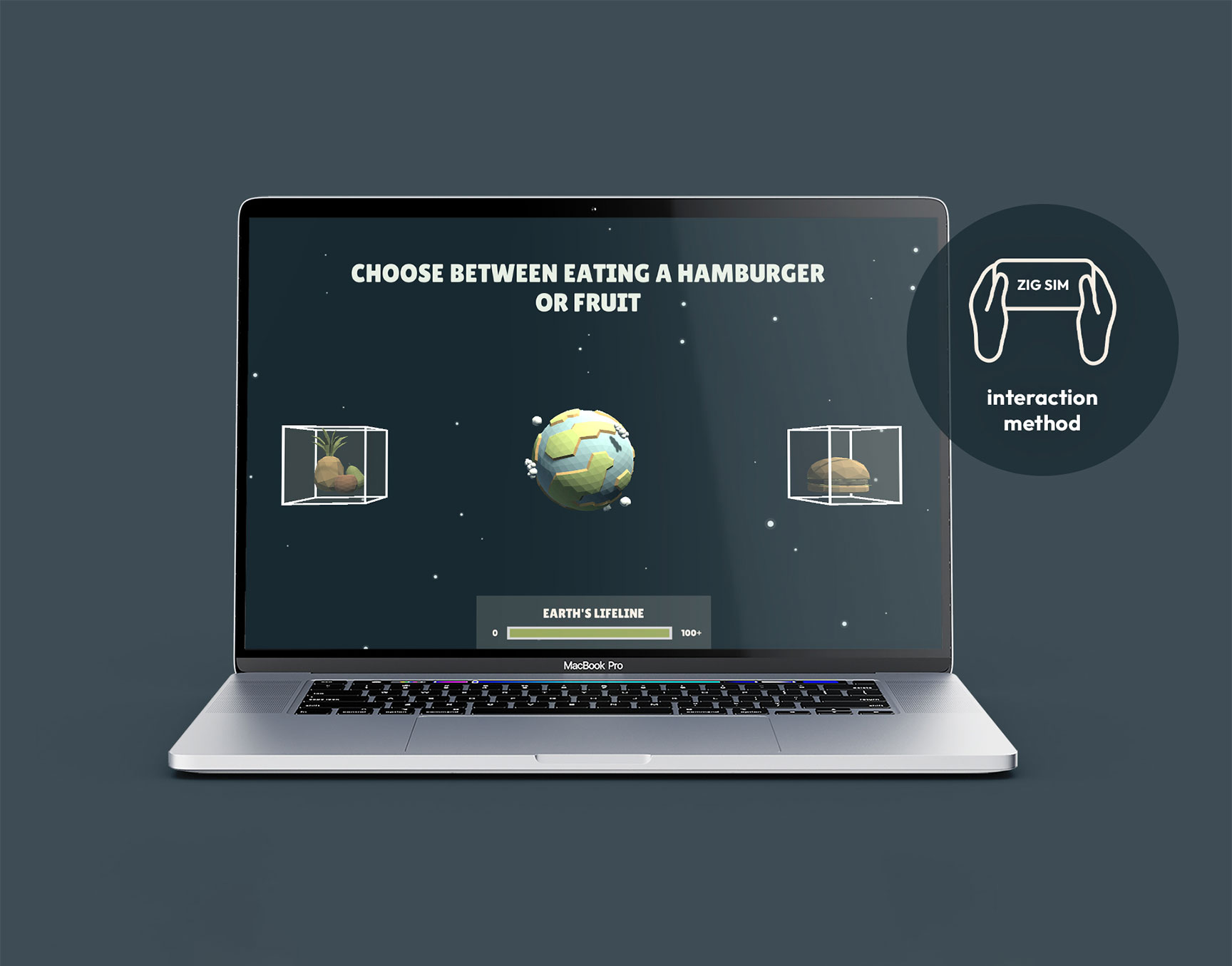
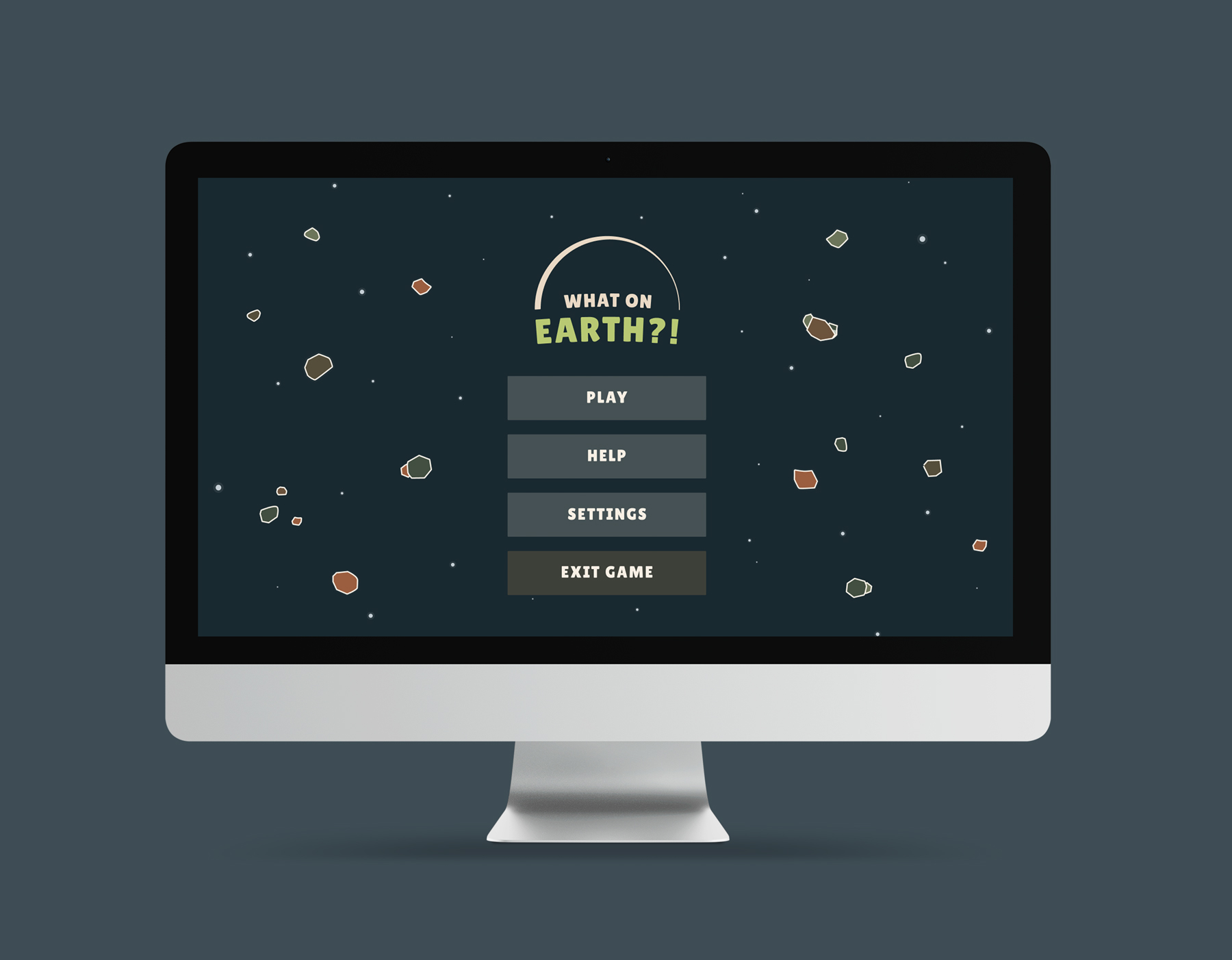
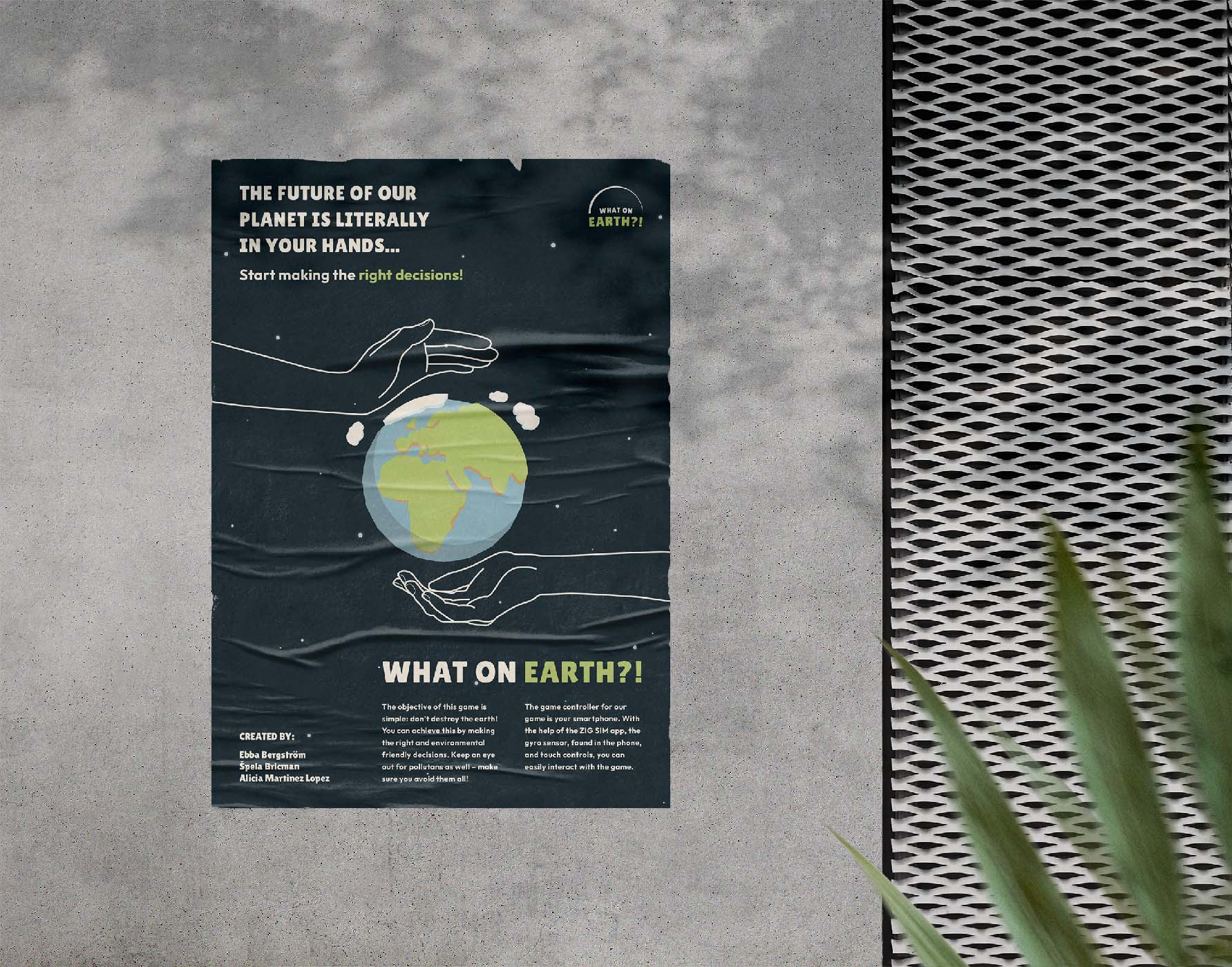
Our game was titled What on Earth?! because we wanted to criticize our current relationship with the planet. In addition, it perfectly fits our overall concept and our main character – the Earth.
Regarding the logo, we opted for a simple and minimalistic design. We combined a semicircle representing the Earth with a fun, bold typeface to form the logo.
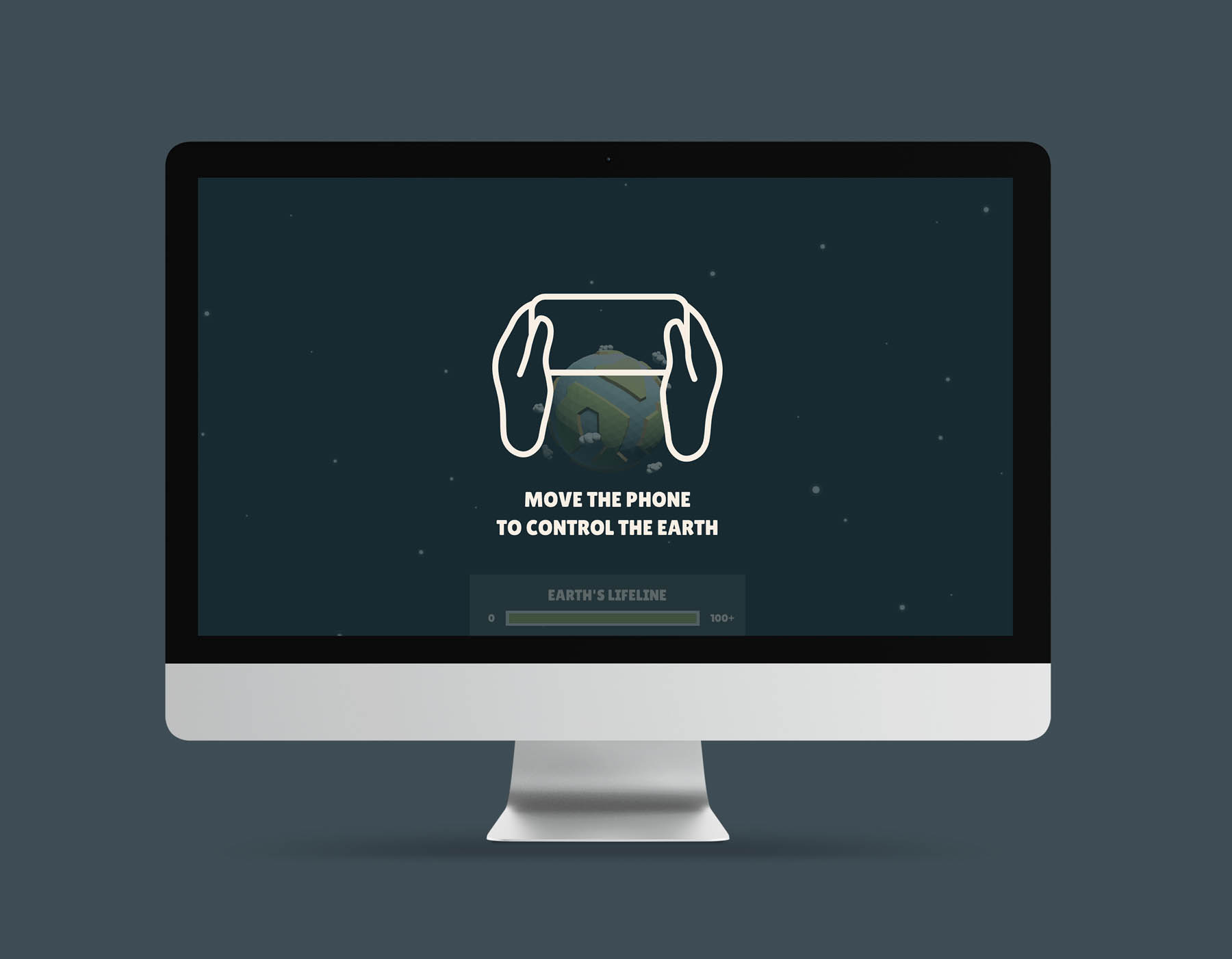
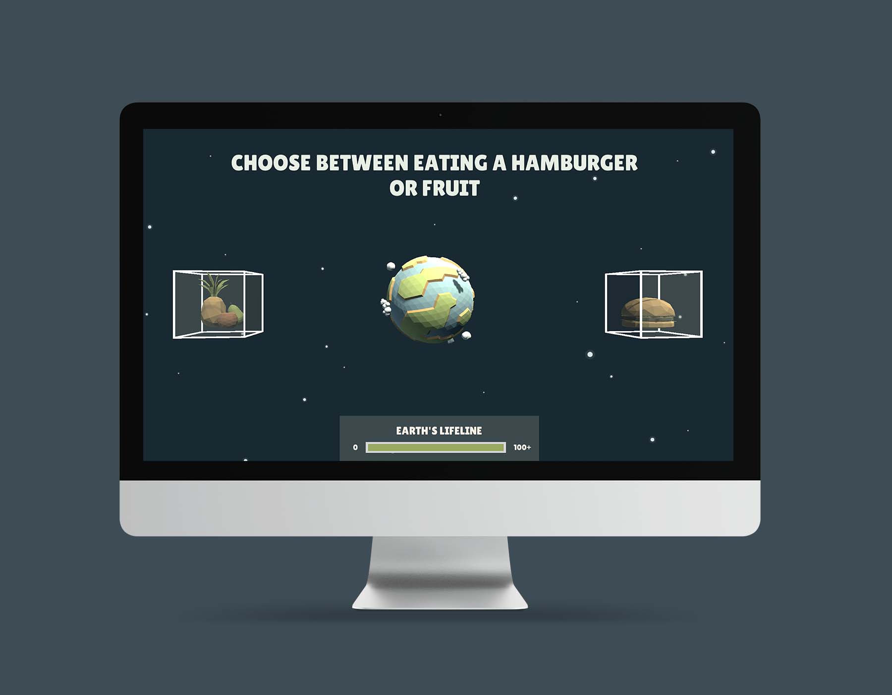
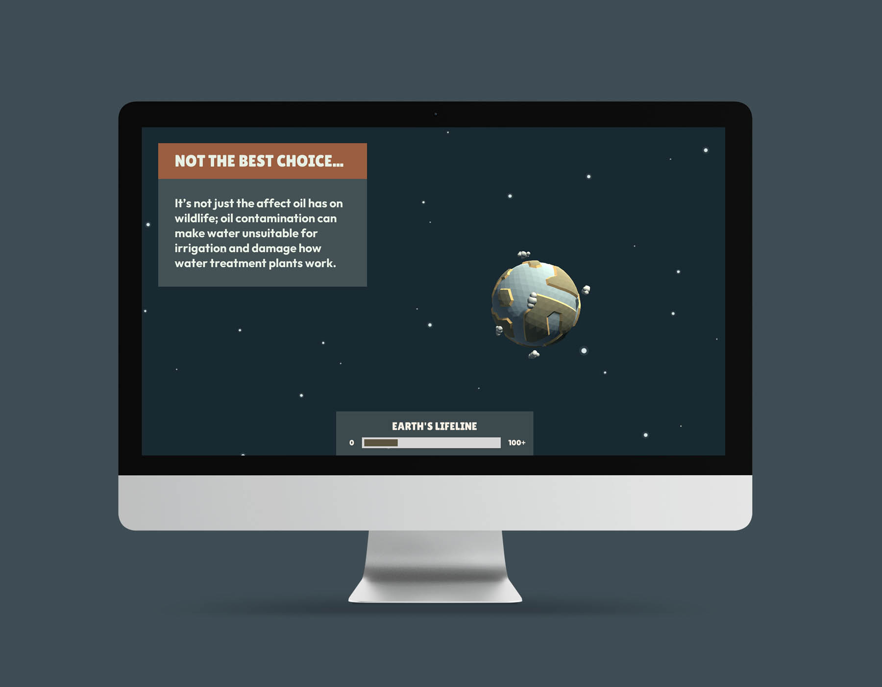
Our idea included changing the Earth’s colors depending on the number of pollutants that hit it and the made decisions. The Earth gets more polluted when you make a wrong decision or can’t avoid the flying pollutant. As a result, we had to create two palettes: clean and dirty. We used the natural color palette in conjunction with the blue space theme.
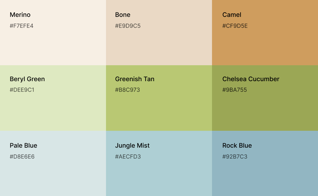
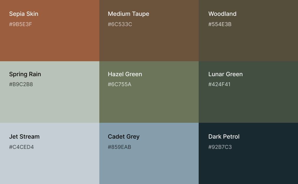
Above is shown the color palette with brighter and more saturated tones. These colors represent cleaner, unpolluted Earth. Based on these colors, we then generated a second color palette that can be seen below. Using this palette, a dirty, polluted Earth was depicted.
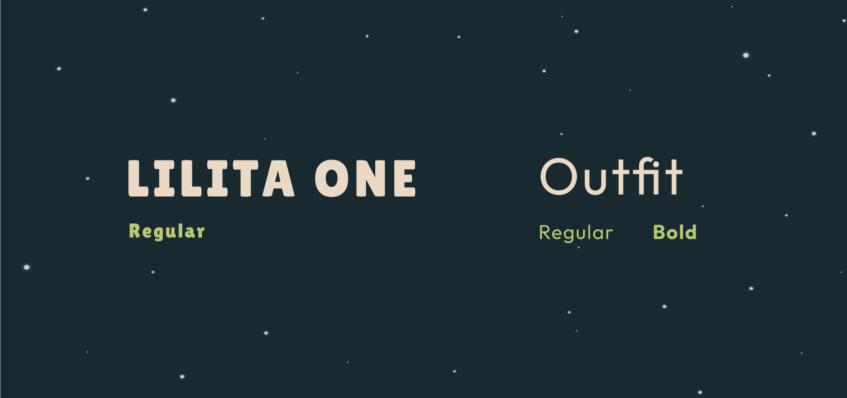
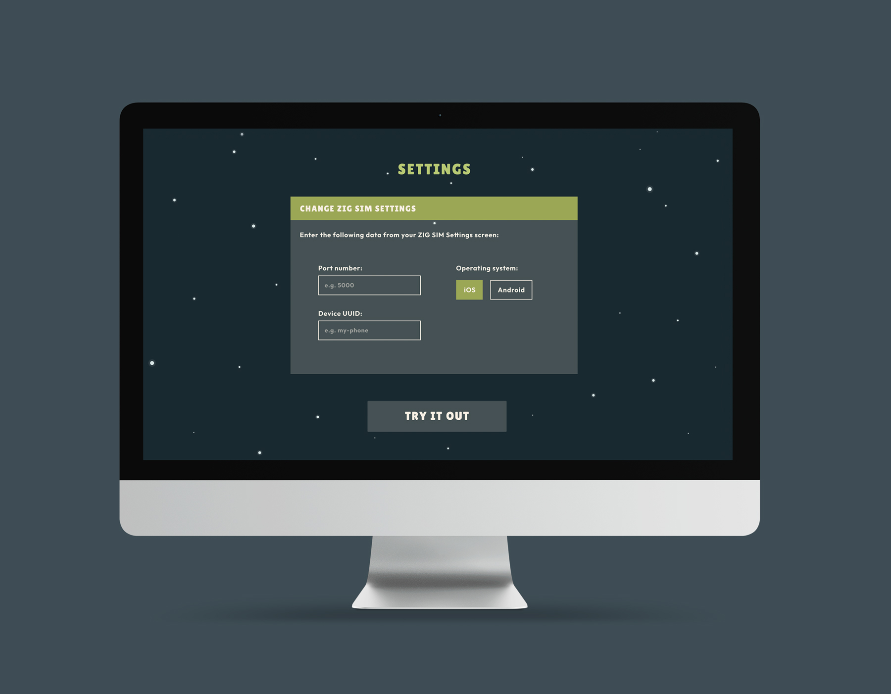
We chose to pair two typefaces: Lilita One and Outfit. The first one is used for titles and main UI elements such as buttons and the lifeline section. We used the second one for facts and tips to achieve the best readability and clean design. Outfit typeface was also used for some UI elements, e. g. text fields and their labels.
![]()
Our game was titled What on Earth?! because we wanted to criticize our current relationship with the planet. In addition, it perfectly fits our overall concept and our main character – the Earth.
Regarding the logo, we opted for a simple and minimalistic design. We combined a semicircle representing the Earth with a fun, bold typeface to form the logo.
Our idea included changing the Earth’s colors depending on the number of pollutants that hit it and the made decisions. The Earth gets more polluted when you make a wrong decision or can’t avoid the flying pollutant. As a result, we had to create two palettes: clean and dirty. We used the natural color palette in conjunction with the blue space theme.
Above is shown the color palette with brighter and more saturated tones. These colors represent cleaner, unpolluted Earth. Based on these colors, we then generated a second color palette that can be seen below. Using this palette, a dirty, polluted Earth was depicted.
We chose to pair two typefaces: Lilita One and Outfit. The first one is used for titles and main UI elements such as buttons and the lifeline section. We used the second one for facts and tips to achieve the best readability and clean design. Outfit typeface was also used for some UI elements, e. g. text fields and their labels.